Navigation

    Logo
    • Register
    • Login
    • Search
    • Recent
    • Tags
    • Unread
    • Categories
    • Unreplied
    • Popular
    • GitHub
    • Docu
    • Hilfe
    1. Home
    2. Deutsch
    3. Entwicklung
    4. Configuration Dialog - Tooltips

    NEWS

    • ioBroker@Smart Living Forum Solingen, 14.06. - Agenda added

    • ioBroker goes Matter ... Matter Adapter in Stable

    • Monatsrückblick - April 2025

    Configuration Dialog - Tooltips

    This topic has been deleted. Only users with topic management privileges can see it.
    • Homoran
      Homoran Global Moderator Administrators last edited by

      Ich kann mich nicht entscheiden 😞

      es ist, wie die anderen sagen, die Optik gegen die Nutzbarkeit.

      Gruß

      Rainer

      1 Reply Last reply Reply Quote 0
      • Y
        ykuendig last edited by

        452_2017-02-15_11_39_01-iobroker.admin.png Weiss nicht obs hilft, aber Kompromissvorschlag:

        Variante 3 In einer Reihe VOR dem Datenfeld

        1 Reply Last reply Reply Quote 0
        • S
          simpixo last edited by

          Also 3 gefällt mir auch ansonsten 1

          Gesendet von iPhone mit Tapatalk Pro

          1 Reply Last reply Reply Quote 0
          • Homoran
            Homoran Global Moderator Administrators last edited by

            <size size="150">3!</size>

            Gruß

            Rainer

            1 Reply Last reply Reply Quote 0
            • N
              Nepomukl last edited by

              jop 3 😉

              sieht gut aus

              1 Reply Last reply Reply Quote 0
              • apollon77
                apollon77 last edited by

                Dann wäre auch ich für 3 🙂

                1 Reply Last reply Reply Quote 0
                • M
                  Marcolotti last edited by

                  Ja, 3! Ist die beste Kombination aus 1 & 2. 😉

                  1 Reply Last reply Reply Quote 0
                  • Thisoft
                    Thisoft last edited by

                    3 gefällt mir auch am Besten. Falls das nicht problemlos machbar ist dann 1 wegen der Funktion…

                    1 Reply Last reply Reply Quote 0
                    • Alex1808
                      Alex1808 last edited by

                      in der Mitte ist geräumt und übersichtlich. Also 3

                      1 Reply Last reply Reply Quote 0
                      • A
                        akamia last edited by

                        Drei halte ich auch für gut.

                        1 Reply Last reply Reply Quote 0
                        • P
                          pix last edited by

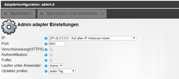
                          Habe für 1 gestimmt. Das tooltip soll doch den Feldnamen erklären, nicht die Auswahl, oder?

                          Und wenn das blaue Info i durch etwas anderes ersetzt wird, ist es auch übersichtlich.

                          Pix

                          1 Reply Last reply Reply Quote 0
                          • Homoran
                            Homoran Global Moderator Administrators last edited by

                            Hallo pix
                            @pix:

                            . Das tooltip soll doch den Feldnamen erklären, nicht die Auswahl, oder? `

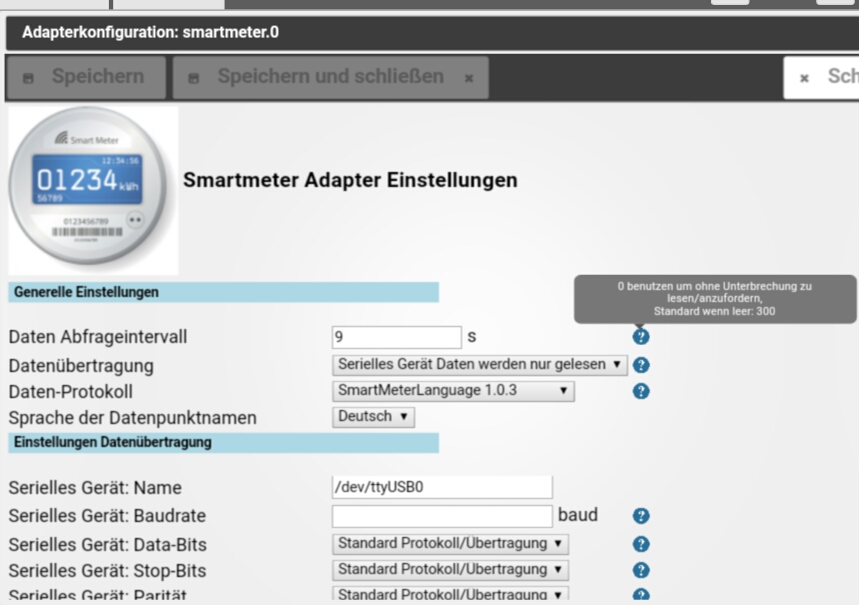
                            Im Smartmeter Adapter sind die Teile bereits drin
                            144_screenshot_20170218-080657.jpg

                            Da werden Werte erklärt, über diese aber auch die Funktion.

                            In anderen Konfigurationsfenstern steht ja auch z.B. "0 zum deaktivieren" neben dem Eingabefeld.

                            Gruß

                            Rainer

                            1 Reply Last reply Reply Quote 0
                            • apollon77
                              apollon77 last edited by

                              Ich habe das Themaüber den Smartmeter-Adapter mal ein bissl angestossen weil ich hier das Problem hatte das zu wenig "Zusatzinfos" in den normalen Adapter-Konfigs untergebracht werden können. So kam ich auf die Idee mit den Böbbels mit Mouseover und teilweise sogar Links zur Github-Seite.

                              Das ganze kam auch aus Feedback zu den History-Adaptern das ein bissl unklar ist wie die ganzen Funktionen genau ticket ud was man wie einstellen kann/soll/muss.

                              Bluefox fand die Idee gut und daher sind wir jetzt hier.

                              Wie oben geschrieben wäre ich inzwischen für Vorschlag 3 … passt immer noch weil es nah am Feld ist

                              1 Reply Last reply Reply Quote 0
                              • First post
                                Last post

                              Support us

                              ioBroker
                              Community Adapters
                              Donate

                              807
                              Online

                              31.7k
                              Users

                              79.8k
                              Topics

                              1.3m
                              Posts

                              14
                              21
                              3414
                              Loading More Posts
                              • Oldest to Newest
                              • Newest to Oldest
                              • Most Votes
                              Reply
                              • Reply as topic
                              Log in to reply
                              Community
                              Impressum | Datenschutz-Bestimmungen | Nutzungsbedingungen
                              The ioBroker Community 2014-2023
                              logo