Schalter & Taster VIS-2
-
-
@tourer4778 sagte in Schalter & Taster VIS-2:
Hallo,
in meiner VIS-2-Ansicht nutze ich aktuell noch einige Widgets aus der alten VIS, zum Beispiel den „Button Toggle vertical“ aus dem Material Design-Paket.
Diese funktionieren zwar grundsätzlich noch, verursachen jedoch immer wieder Fehlermeldungen, die ich nun nach und nach beseitigen möchte.In meiner VIS-2 verwende ich einfache Schalter, die je nach Schaltzustand ihre Farbe ändern.
Welches aktuelle Widget eignet sich dafür am besten? Ich habe mir bereits alle verfügbaren Widgets angesehen, konnte aber keine passende Alternative finden.Außerdem noch eine Frage: Die Widgeteria lässt sich bei mir nicht öffnen, funktioniert sie derzeit generell nicht?
Beispiel
Für sowas kannst Du auch die vis-2-widgets-collection nutzen.
-
Wenn ich das richtig sehe, kann ich da auch nur mit Icons arbeiten.
Bei dem alten Button fand ich es toll, das ich nur die Farben angeben musste.
-
Willst du auch schalten oder nur eine Anzeige ?
-
@sigi234
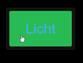
Schalten und den Schaltzustand anzeigen.Ich wusste nicht, das es in VIS-2 so schwer ist, ein Button einzubinden, der nur die Farbe ändert, je nach Zustand.
-
@tourer4778 sagte in Schalter & Taster VIS-2:
@sigi234
Schalten und den Schaltzustand anzeigen.Ich wusste nicht, das es in VIS-2 so schwer ist, ein Button einzubinden, der nur die Farbe ändert, je nach Zustand.
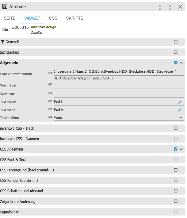
[
  {
    "tpl": "tplInventwoWidgetUniversal",
    "data": {
      "bindings": [],
      "type": "switch",
      "g_common": true,
      "mode": "singleButton",
      "direction": "column",
      "oid": "0_userdata.0.ON_OFF",
      "httpType": "send",
      "buttonSize": 41,
      "btnSpacing": 10,
      "countStates": 2,
      "buttonHoldValue": false,
      "dialogWidth": 500,
      "g_attr_group_type_view_in_dialog": true,
      "dialogHeight": 300,
      "dialogPadding": 10,
      "dialogBackground": "rgb(18, 18, 18)",
      "dialogTitleColor": "rgb(255,255,255)",
      "dialogTitleSize": 20,
      "dialogCloseButtonBackground": "rgba(255,255,255,0)",
      "dialogCloseButtonColor": "rgba(255,255,255,1)",
      "dialogCloseButtonSize": 14,
      "dialogBorderRadiusTopLeft": 12,
      "dialogBorderRadiusTopRight": 0,
      "dialogBorderRadiusBottomRight": 12,
      "dialogBorderRadiusBottomLeft": 0,
      "clickThrough": false,
      "g_attr_group_click_feedback": true,
      "feedbackDuration": 0,
      "backgroundFeedback": "",
      "outerShadowColorFeedback": "rgba(0, 0, 0, 1)",
      "contentBlinkInterval": 0,
      "g_attr_group_state_default": true,
      "outerShadowColor": "",
      "colorPickerColorModel": "hex",
      "g_attr_content_color_picker": true,
      "colorPickerWidth": 200,
      "colorPickerHandleSize": 8,
      "colorPickerHandleMargin": 6,
      "colorPickerComponentsSpace": 12,
      "colorPickerDirection": "vertical",
      "colorPickerBorderWidth": 0,
      "colorPickerShowWheel": true,
      "colorPickerShowSaturation": true,
      "colorPickerShowValue": true,
      "textDecoration": "none",
      "g_attr_group_css_text": true,
      "textMarginTop": 0,
      "textMarginBottom": 0,
      "textMarginLeft": 0,
      "textMarginRight": 0,
      "contentType": "html",
      "g_attr_group_css_content": true,
      "contentMarginTop": 0,
      "contentMarginBottom": 0,
      "contentMarginLeft": 0,
      "contentMarginRight": 0,
      "contentSize": 0,
      "contentRotation": 0,
      "contentMirror": false,
      "flexDirection": "row",
      "g_attr_group_css_alignment": true,
      "alignItems": "center",
      "textAlign": "center",
      "contentAlign": "center",
      "backgroundOpacity": 1,
      "g_attr_group_css_transparency": true,
      "contentOpacity": 1,
      "paddingLeft": 0,
      "g_attr_group_css_spacing": true,
      "paddingRight": 0,
      "paddingTop": 0,
      "paddingBottom": 0,
      "borderRadiusTopLeft": 0,
      "g_attr_group_css_border_radius": true,
      "borderRadiusTopRight": 0,
      "borderRadiusBottomRight": 0,
      "borderRadiusBottomLeft": 0,
      "borderSizeTop": 0,
      "g_attr_group_css_border": true,
      "borderSizeBottom": 0,
      "borderSizeLeft": 0,
      "borderSizeRight": 0,
      "borderStyle": "none",
      "outerShadowX": 0,
      "g_attr_group_css_outer_shadow": true,
      "outerShadowY": 0,
      "outerShadowBlur": 0,
      "outerShadowSize": 0,
      "innerShadowX": 0,
      "g_attr_group_css_inner_shadow": true,
      "innerShadowY": 0,
      "innerShadowBlur": 0,
      "innerShadowSize": 0,
      "undefined1": null,
      "compareBy1": "default",
      "oid1": "0_userdata.0.ON_OFF",
      "comparisonOperator1": "===",
      "value1": "false",
      "view1": null,
      "text1": "LICHT 1 OFF",
      "textTrue1": "LICHT 1 ON",
      "icon1": null,
      "iconTrue1": null,
      "image1": null,
      "imageTrue1": null,
      "html1": null,
      "htmlTrue1": null,
      "viewInWidget1": null,
      "viewInWidgetTrue1": null,
      "contentBlinkInterval1": null,
      "stateColorsStyleFromWidget1": null,
      "contentColor1": "",
      "contentColorTrue1": "",
      "background1": "rgba(249,33,16,1)",
      "backgroundTrue1": "rgba(6,241,71,1)",
      "textColor1": "rgba(0,0,0,1)",
      "textColorTrue1": "rgba(0,0,0,1)",
      "borderColor1": null,
      "borderColorTrue1": null,
      "outerShadowColor1": "rgb(0,0,0)",
      "outerShadowColorTrue1": "rgb(0,0,0)",
      "innerShadowColor1": null,
      "innerShadowColorTrue1": null,
      "contentSize1": null,
      "g_countStates-1": true,
      "valueFalse": "false",
      "valueTrue": "true",
      "undefined2": null,
      "compareBy2": "default",
      "oid2": "0_userdata.0.ON_OFF",
      "comparisonOperator2": "===",
      "value2": "true",
      "view2": null,
      "text2": "LICHT 1 ON",
      "textTrue2": null,
      "icon2": null,
      "iconTrue2": null,
      "image2": null,
      "imageTrue2": null,
      "html2": null,
      "htmlTrue2": null,
      "viewInWidget2": null,
      "viewInWidgetTrue2": null,
      "contentBlinkInterval2": 0,
      "stateColorsStyleFromWidget2": null,
      "contentColor2": null,
      "contentColorTrue2": null,
      "background2": "rgba(33,234,2,1)",
      "backgroundTrue2": "rgb(69,86,24)",
      "textColor2": "rgba(2,2,2,1)",
      "textColorTrue2": null,
      "borderColor2": null,
      "borderColorTrue2": null,
      "outerShadowColor2": "rgb(0,0,0)",
      "outerShadowColorTrue2": "rgb(0,0,0)",
      "innerShadowColor2": null,
      "innerShadowColorTrue2": null,
      "contentSize2": 0,
      "g_countStates-2": true
    },
    "style": {
      "bindings": [],
      "left": "964px",
      "top": "50px",
      "width": "177px",
      "height": "52px",
      "position": "absolute",
      "overflow": "visible",
      "z-index": "4"
    },
    "widgetSet": "vis-2-widgets-inventwo",
    "_id": "i000001"
  }
]
Objekt ID's anpassen.
-
@tourer4778 sagte in Schalter & Taster VIS-2:
Wenn ich das richtig sehe, kann ich da auch nur mit Icons arbeiten.
Bei dem alten Button fand ich es toll, das ich nur die Farben angeben musste.
Dann lass die Icons doch einfach weg.
-
@carsten04
Das bekomme ich irgendwie nicht hin, kannst du mir das Wiget mal Exportieren? -
@tourer4778 sagte in Schalter & Taster VIS-2:
@carsten04
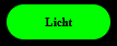
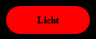
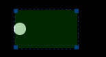
Das bekomme ich irgendwie nicht hin, kannst du mir das Wiget mal Exportieren?[ { "tpl": "tplStateCollectionWidget", "data": { "bindings": [], "iconXOffset": "0px", "g_common": true, "iconYOffset": "0px", "noHeaderIcon": false, "header": "", "footer": "", "basePadding": 1, "baseElevation": 4, "oid": "0_userdata.0.example_state", "unit": "", "g_button": true, "values_count": 2, "sampleInterval": false, "sampleIntervalValue": 200, "delay": 300, "onlyStates": true, "statePushButton": false, "onlyDisplay": false, "oidType": "boolean", "write": true, "minValue": 0, "maxValue": 100, "icon": "", "value1": true, "alias1": "Licht", "value2": false, "alias2": "Licht", "noHeader": true, "noFooter": true, "backgroundColor1": "rgba(24,195,17,1)", "backgroundColor2": "rgba(201,17,37,1)", "valueSize": 289, "outlined": false, "outlinedFrame": true, "frameBackgroundColor2": "", "ellipse": false, "circle": false }, "style": { "bindings": [], "left": "122px", "top": "104px", "width": "126.962px", "height": "71.9292px", "position": "" }, "widgetSet": "vis-2-widgets-collection", "_id": "i000001" } ]HIER findest Du zu den Widgets viele Infos, die Dir ggf. noch wieter helfen können.
-
@carsten04
super, danke dir / euch, ich denke, das ist genau das, was ich brauche.
